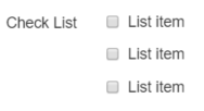
Check List Element
A Check List displays a list of items, each with its own check box, from which the user can select one or more items.
At runtime the user selects and deselects items in the list by clicking or tapping the item. Selecting an item will check its check box, deselecting the item will uncheck its check box.
A user can select as many items in the list as they like.
The items to be included in the list are supplied from a database and you can use an existing remote database to supply these values or create a Digitise Forms database especially to store the list items. For each item the database can provide either a description or an image or both to be displayed in the list.
The Form Studio doesn't read in your list of items so you won't be able to see the list within your form as you design it. You can, however, display a representation, or mock-up, of your list to give you an idea of what the form will look like when the list is populated at runtime:

You can configure this mock-up under the Data tab in the Element's Properties (see under Properties below).
Once you have placed a Check List Element on a page, you can edit the Element's properties to configure the Element for your requirements. Select the Element on the page to display its properties in the Properties Pane. The following properties are available:
Label
Allows you to specify a description or question that will be displayed to the left of the list. You can change the default label to provide a more meaningful description or option for your users.

Visible and Disabled Properties
Display Inline
If this property is not selected, each list item is displayed on a separate line:

If selected, the items will be displayed in a horizontal list instead:


The properties in this section allow you to specify validation criteria for the Element.

The properties in this category allow you to specify data mappings for this Check List and its contents and to pre-select one or more items in the list, if required.
Value
Contains the currently selected item or items. If you specify an input value or input data mapping here, this will be used to determine the initial selection within the list when the page loads. An output mapping will output the currently selected item(s).
List Items
Allows you to specify the items to be displayed in the list. If you want to display a mock-up of a populated Check List within the Form Design workspace, you configure this under this property as well.
For full details refer to the

Data Category
Separator
A string defining two or more selected items in a check list uses the character specified in this property to identify individual items in the string. By default the separator character is a '|' character and the string will look something like:
Brown Furniture|Sofa, Arm Chair|White Goods|Garden Waste
This type of string can be read in from a Datasource or entered into the Value property to define which items in the Check List should be marked as selected. If the list has an output mapping and there are multiple items selected, all selected items will be output in a single string using this format.
If you need to specify a different character to separate items in the string, you can enter the required character in this property.
If you have upgraded a project created using a version of Digitise Forms earlier than Digitise Forms - 2021 Spring Update, for backwards compatibility, this property will retain the previous value from before the upgrade.
Image Category
Image Height
Specifies the height, in pixels, for images displayed within the list items. If you specify the height but not the width, the width will automatically be adjusted to maintain the original aspect ratio of the image. If you leave both the height and width blank the image will be displayed at its actual size. If images are not included in the list items, this property is ignored.
Image Width
Specifies the width, in pixels, for images displayed within the list items. If you specify the width but not the height, the height will automatically be adjusted to maintain the original aspect ratio of the image. If you leave both the height and width blank the image will be displayed at its actual size. If images are not included in the list items, this property is ignored.
Image Position
Determines whether images included in the Dataset used to populate the list are displayed to the left or right of the item's labels. If images are not included in the list items, this property is ignored.
Sorting Category
Sort Order
Choose between listing the items in ascending or descending order. Alternatively, select None to display items in the order they are received.
Sort By
Choose between displaying the list based on the contents of the Label or Value columns.
Styles Category
Label, Option Labels and Error Message
These properties allow you to assign styles to the Label, list items and invalid data error message text, respectively, e.g. to set the font type, size and colour.
