Validate User Input
When users are filling in your form, you might want to check that the information they enter is valid and that they have provided all the information you need. Digitise Forms provides a number of ways to allow you to validate data input:
- Marking an Element as 'Required'
- Using one of the supplied format checkers
- Comparing user input against a 'regular expression'
- Custom validation using JavaScript
- Setting a maximum number of characters which can be entered
Most Elements which allow data input or user selection can be validated in one or more of the above ways.
In addition, you can also specify that required, format checking and maximum length validations should be performed by a form's Digitise Forms Server component when data is sent to it, in order to mitigate against invalid data being sent directly to the Digitise Forms Server and bypassing a form's validation process. For more details about server-side validation refer to the
Validation is defined separately for each Element on a form; in the Element's properties under the Rules tab in the Properties Pane.
If validation is specified, when a user is completing a form, the validation will be performed in one or more of the following situations, depending upon the Element:
- When the value within an Element changes
- When the Element loses focus
- When a user attempts to move forward to a different page within the form
- When the form is submitted, using a Submit button, using an Event action or calling the submitForm scripting function
- When a user types or pastes a value into the Element
- Elements are not validated if they are hidden when the validation takes place.
The File Upload and Capita Pay360 Cart Elements only allow you to mark the Element as Required and use a different method to configure validation than that described here. For details refer to the separate
For all other Elements, which support validation, you can specify validation as follows:
Select the Element in the Form Design workspace.
The Element's properties will display in the Properties Pane.
Validation is handled under the Rules tab,  . If an Element doesn't have a Rules tab within its properties, the Element cannot be validated using the Rules properties discussed here. However, you may be able to validate it another way, for example using custom JavaScript in conjunction with an Event or by using a SQL Server Stored Procedure instead. Complex Elements may only allow validation of some parts of the Element and won't display any Failure messages specified.
To specify validation, click on the Rules tab,  , if not already selected.
Click on the Rules button,  .
.
The Rules Builder pop-up will be displayed:
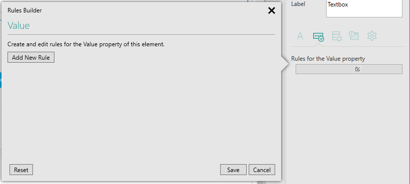
At the top of the pop-up, the heading displays the name of the Element's property whose value will be validated at runtime, in the image above it is the selected Element's value property.
The Rules Builder pop-up allows you to specify one or more validation rules for this Element.
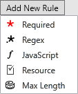
To add a new rule, click on  .
.
The following menu will be displayed:
Elements marked as required, must have data entered or selected by the user before they can move to another page or submit the form. Required Elements are indicated on the form by the presence of a red asterisk at the end of the Element's label.
If a user attempts to move forward to a different page or submit the form without entering all the required information, the current page will remain displayed and all non-entered required Elements will display a red border.
- You can allow the user to jump to a page out of sequence if you want to by marking the page as nonsequential, which is done using the Nonsequential property in the page properties. For example, you might want to provide a help page which the user can access from any point within the form.
To mark an Element as required, click on  and then choose Required from the menu.
You will then see the following validation rule displayed in the Rules Builder:
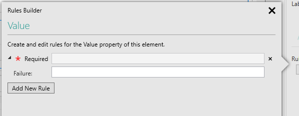
The Failure option allows you to enter a message to be displayed on the form if the Element fails this validation check at runtime. Click on the Expand,  , and Collapse,
  , buttons to the left of the validation rule to show and hide the error message field.
The supplied format checkers allow you to check that a user has entered the correct type of information in a field. You can use them to check for email, NHS Number, postcode, UK telephone number and URL formats.
The format checkers will check that the value entered by the user at runtime is consistent with the format specified. For example, if you specify that the field should be a postcode, Digitise Forms uses the UK Postcode regular expression, available from the UK government web site, to validate that the user has entered a postcode. This expression doesn't check that the postcode is genuine for the address entered, simply that it matches the standard format for UK postcodes and only contains characters which could be a genuine postcode.
If the user doesn't enter a value at runtime, the validation will not be performed.
To use one of the supplied format checkers, click on  and then choose Resource from the menu.
You will then see the following validation rule displayed in the Rules Builder:
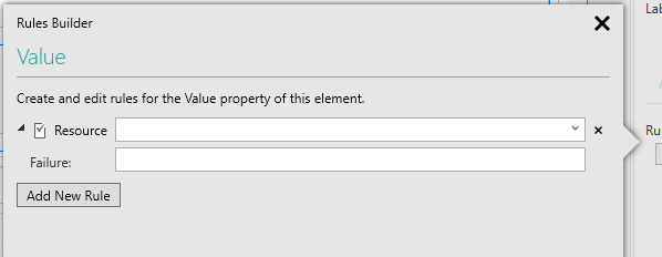
Click on the down arrow at the end of the text box to display a list of available formats that can be checked. Select the appropriate one from the list.
The Failure option allows you to enter a message to be displayed on the form if the Element fails this validation check at runtime. Click on the Expand,  , and Collapse,
  , buttons to the left of the validation rule to show and hide the error message field.
This option allows you to specify your own validation criteria using a regular expression. Regular expressions consist of a text string which defines search or comparison criteria which can be used in Digitise Forms to validate information entered by a user. Regular expressions allow you to compare user input against a character map of the expected input, for example to validate that a user has entered a UK telephone number you could check that the value entered starts with 0, ( or '+', and if with a '+' that it is followed by 44). Regular expressions have the ability to provide sophisticated validation criteria.
Unfortunately, it is outside the scope of this user guide to delve into the potentially complex subject of formulating regular expressions, so if you are not familiar with them, search on line for more information.
To specify this type of validation, click on  and then choose Regex from the menu.
You will then see the following validation rule displayed in the Rules Builder:
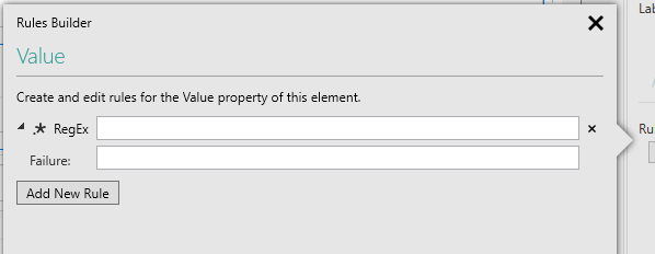
Type in the required regular expression in the upper of the two text boxes.
The Failure option allows you to enter a message to be displayed on the form if the Element fails this validation check at runtime. Click on the Expand,  , and Collapse,
  , buttons to the left of the validation rule to show and hide the error message field.
This option allows you to specify customised validation by writing your own JavaScript function(s) to perform whatever validation you require.
To specify this type of validation, click on  and then choose Javascript from the menu.
You will then see the following validation rule displayed in the Rules Builder:
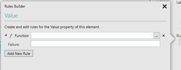
If you have already written a JavaScript function for another Element and that function will work here without any changes, you can assign that same function to perform validation for this Element too. Click on the down arrow in the text box. A list of your current JavaScript functions will be displayed from which you can choose the one you want to assign to this Element's validation.
For more information about using JavaScript in your forms, refer to Customise Forms with JavaScript.
If you don't already have a suitable function, you can write your own by clicking on the  button to open the custom JavaScript file within an editor.
A skeleton JavaScript function will automatically be created called <page name>_<element name>_validate<property name>. You can edit this function or create one of your own. If you create one of your own, you will need to assign it to this validation when you have finished as described above under Using an existing Script.
When you have finished creating your Script, reload the page you were working on, by selecting it from the Pages tab in the Project Explorer, if necessary.
Reselect the Element and click on the Rules tab,  , again.
Click on  to reload the Rules Builder.
The Failure option allows you to enter a message to be displayed on the form if the Element fails this validation check at runtime. Click on the Expand,  , and Collapse,
  , buttons to the left of the validation rule to show and hide the error message field.
This option allows you to specify the maximum number of characters a user can type into a text-based Element, such as a Text Box, at runtime. The default value is 50. At runtime, when typing into the Element, once the limit specified here is reached any further characters typed will be ignored. If a user attempts to paste in a value longer than that permitted, it will be truncated at the limit set.
Note, however, that if you output map an Element, the maximum number of characters which can be entered at runtime will be the smaller of the output mapped Dataset column's Max Length setting or the value specified here. For example, suppose you specify a Max Length of 50 and then output map the Element to a Dataset column which has a Max Length of 35, the Element will be restricted to 35 characters at runtime. You can check the maximum length of a Dataset column under the Mappings tab for the relevant Dataset.
To specify this type of validation, click on  and then choose Max Length from the menu.
You will then see the following validation rule displayed in the Rules Builder:
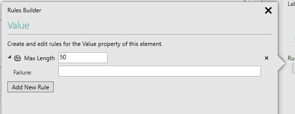
Type in the maximum length you want to set in the Max Length field.
The Failure option allows you to enter a message to be used in the event that the Element fails this validation check at runtime. Click on the Expand,  , and Collapse,
  , buttons to the left of the validation rule to show and hide the error message field.
This validation is not relevant to all Elements and if set where it is not appropriate, it will be ignored.
This validation only takes effect if the Element has an output mapping specified.
This validation may have no effect in some browsers with Text Box Elements when the Element's Is Numeric property is selected.
If you have specified Server-side validation (see below) and the mapped data item fails this validation check at runtime, for security reasons, only a non-specific HTTP 400 Bad Request error will be returned to the sender but any message entered in the Failure option will be output to the Digitise Forms Server log. Where the validation takes place within the form itself, the Failure message will not be displayed and the Element will not be surrounded by a red border.
You can add more than one type of validation to an Element, if you need to.
For example, you might want to specify that an element is both required and that it should contain an email address.
To do this, add the first validation, selecting Required from the  button menu. Then click the
  button again and this time choose Resource. Both validation rules will be displayed in the Rules Builder and you can then choose to check for an email format in the Resource rule.
You can remove a validation item from the list of validations assigned to the current Element, by clicking on the  button to the right of the validation item you want to remove. Note that if you remove a JavaScript validation, the JavaScript itself will not be deleted and will still be available to apply to other Elements.
When you have finished specifying your validation rules, click on the Save button to save your changes or on the Cancel button to close the pop-up and lose your changes. The Reset button will clear the pop-up contents, allowing you to start again.
The Rules property will now show your current validation rules:
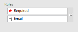
- If you mark an Element as Required, you will need to reload the form in order to display the red asterisk beside the Element in the Form Design workspace.
If you want to change the validation rules for an Element, first select the Element to display its properties. Then open the Rules tab,  , and click on the Rules button,
  , to display the Rules Builder pop-up again. You can now edit the validation rules within the pop-up in the same way as when creating new rules. If you want to change the validation type, e.g. from Required to Resource, you will need to delete the original rule and add a new one for your new validation type. If you have a Resource validation selected, however, you can change the format, e.g. from Postcode to UK Phone Number, by simply selecting a different format from the drop-down list; you don't need to delete the rule and add it in again.
At runtime, if an Element fails a validation check, other than maximum length, it will automatically be surrounded by a red border to indicate to the form user that there is an issue. This border will remain displayed until the user enters a valid value within the Element. If, after validating a page, the first invalid Element on the page is not currently visible, the page will be scrolled to bring the first invalid Element into view.