Multiselect Element
The Multiselect Element is used to add a drop-list to your form, which can be filtered, and from which one or more selections can be made. In order to select one or more items from the list, the user must display the list by tapping or clicking on the Element or on the down arrow at the right-hand side of the Element (depending on how the Element has been configured - see below). They can then select an item by tapping or clicking it, which will add it to the list of selected items. There are a number of ways in which the selected items can be displayed (discussed below), and when a Multiselect Element has been added to your form, it will resemble the following:

Once you have placed a Multiselect Element on a page, you can edit the Element's properties to configure the Element for your requirements. Select the Element on the page to display its properties in the Properties Pane.
The following properties are available:
Element Version
The Element's version number, which may be (and is often) different to the installed version of the Digitise Forms software. For example, the version of the Element might be 1.5, but the version of the in-use/installed Digitise Forms software might be 2.0 etc.
Label
Allows you to change the text displayed in the label for this Element. You can change the default label to provide a more meaningful description or option for your users.

Visible and Disabled Properties
Placeholder
Allows you to specify the placeholder text that will be displayed within the drop-list at form runtime where no selection has been made.
Mode
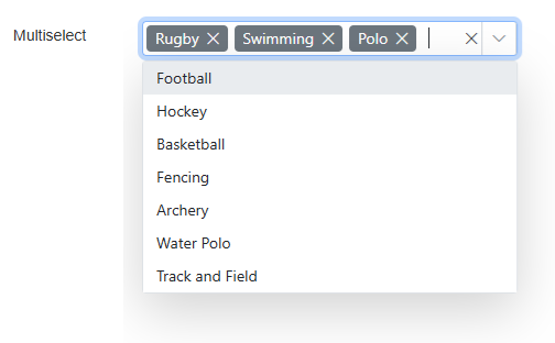
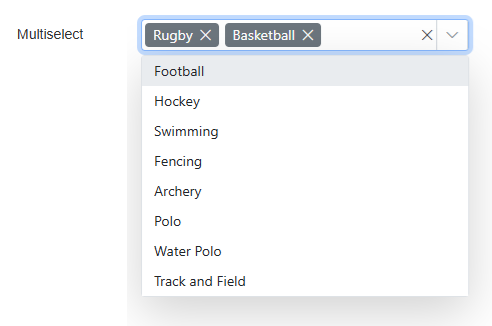
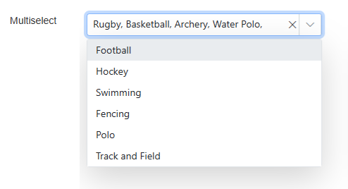
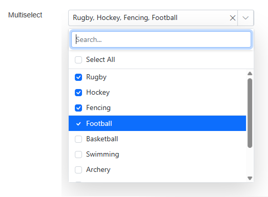
Allows you to specify the visual mode for both the drop-list contents and any selected items. The available options are: Default, Box, Delimiter, and CheckBox. In the examples shown below, a list of sporting activities has been created and selections from within the list have been made to illustrate how both the list and the selected items will be displayed using the different Mode settings. Note that items will be rendered the same using the Default and Box options.
Default:

Box:

Delimiter:

CheckBox:


The properties in this section allow you to specify validation criteria for the Element.

The properties in this category allow you to specify data mappings for this Multiselect and its contents and to pre-select one or more items in the list, if required.
Value
Contains the currently selected item/s. If you specify an input value or input data mapping here, this will be used to determine the initial selection/s within the list when the page loads. An output mapping will output the currently selected item.
List Items
Allows you to specify the items to be displayed in the list.
For full details refer to the

Behaviour Category
Close Popup on Select
Allows you to choose whether the Multiselect's drop-list will stay open or will close once one or more items have been selected.
Hide Selected Items
Allows you to choose whether items within the drop-list will be hidden or will remain visible after they have been selected.
Open on Click
Allows you to choose whether the Multiselect's drop-list can be opened by clicking anywhere within it, or whether it can only be opened by clicking on the down arrow at the Element's right-hand side.
Check Box Mode Category
Select All
Allows you to choose whether all items within the drop-list can be selected or deselected when in CheckBox mode.
Select All Text
The label text of the Select All checkbox.
Unselect All text
The label text of the Unselect All checkbox.
Search Placeholder
The text to display in the search box of the Multiselect when in CheckBox mode, when it is empty.
Searching Category
Searchable
Allows you to choose whether the items contained within the Element's drop-list are searchable.
Filter Type
Allows you to determine the way in which the items contained within the drop-list will be filtered. The available options are: StartsWith, EndsWith, and Contains.
Sorting Category
Sort Order
Allows you to determine the order in which the drop-list items will be sorted. The available options are: None, Ascending, and Descending.
Styles Category
Label, Multiselect, and Error Message
Allow you to assign a style to the label, the Multiselect, and the invalid data error message text, respectively, e.g. to set the font type, size and colour.
