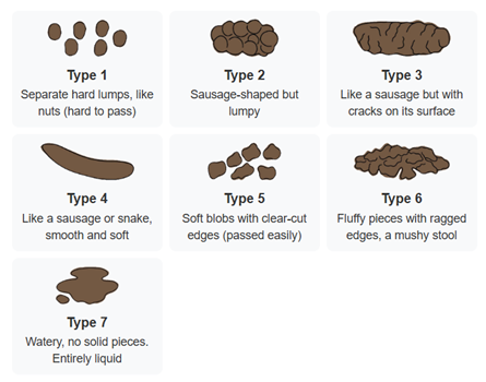
Stool Chart Element
The Stool Chart Element displays seven icons that represent different stool types, from which a user can select one. Within Healthcare settings, the Stool Chart Element can be used to quickly obtain an accurate description of a stool, negating the need for explanatory notes to be taken following (or during) a patient consultation or observation etc. When a Stool Chart Element has been added to the form, at runtime, it will be displayed as follows:

One of the stool type icons can be configured to be pre-selected/to act as the default, as discussed below.
Once you have placed a Stool Chart Element on a page, you can edit the Element's properties to configure the Element for your requirements. Select the Element on the page to display its properties in the Properties Pane.
The following properties are available:
Element Version
The Element's version number, which may be (and is often) different to the installed version of the Digitise Forms software. For example, the version of the Element might be 1.5, but the version of the in-use/installed Digitise Forms software might be 2.0 etc.
Label
Allows you to change the text displayed in the label for this Element. You can change the default label to provide a more meaningful description or option for your users.

Visible and Disabled Properties
Show Label
Lets you show or hide the Element's label at form runtime. To hide the label so that the facial expressions only are displayed, deselect this option.
Layout
Allows you to specify the position/alignment of the Stool Chart Element. The options available are Left, Right, and Center.

The properties in this section allow you to specify validation criteria for the Element.

Value
Contains the selected value for the Stool Chart Element. A number corresponding to one of the stool types can be chosen from a list to act as the default/pre-selected option, using the up/down arrows at the right-hand side of the property. The list contains the values 0 (for no stool type selected), through to 7, with each value above 0 representing one of the Element's stool types. Alternatively, you can specify an input mapping to read the default/pre-selected value in from a Datasource, but no stool type will be selected at runtime if the value isn't between 1 and 7 (inclusive).
For more information about mapping properties to data items in a Datasource see Data Tab Properties.

Styles Category
Label Style
Allows you to assign a style to the Element's label, e.g., to set the font type, size, and colour.
Buttons, Buttons Heading, and Buttons Description
Allow you to assign a style to the constituent parts of the Element's Stool Type buttons, e.g., to set the font type, size, and colour.
Error Message
Allows you to assign a style to the invalid data error message text.
