Address Finder Element
The Address Finder allows users to enter address details within a form. It provides for postcode lookup but also gives an option to manually enter the address instead.
The postcode look up facility currently uses the website getaddress.io to retrieve a list of possible addresses from a postcode entered at runtime. In order to use this feature you will need to sign up to the getaddress.io website and obtain an API Key from them. This will involve the payment of a modest monthly subscription fee. The device running the form will also need an internet connection in order to contact the website.
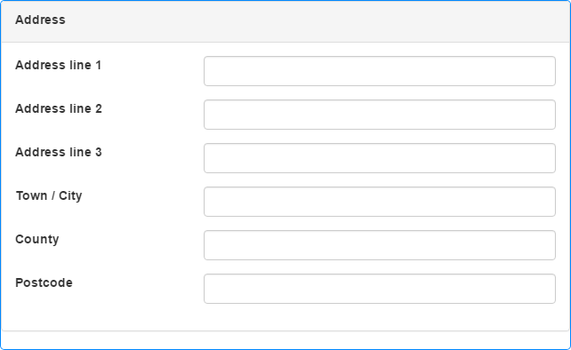
When you add an Address Finder to a form, it displays the manual address input fields:

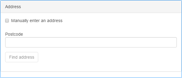
If you enter an API Key in the Element's properties (see below), the Element will change to the postcode look up format:

The Address Finder is a complex Element consisting of multiple fields.
In manual address entry mode, the element displays the following fields:
- A heading, displayed at the top of the Element, which you can change.
- A series of text boxes allowing the user to enter the address manually. These fields are labelled in a standard manner indicating which part of the address to enter where, e.g. Town/City, County, Postcode etc., but the labels can be changed if required.
In postcode lookup mode, the Element changes to provide the following fields instead:
-
A heading, displayed at the top of the Element, which you can change.
-
A check box allowing the user to bypass the postcode selection and enter the address manually. You can change the check box's default label, e.g. to say something more meaningful in the context of your form.
If a user checks this check box, the displayed fields change to a series of address fields, Town/City, County, Postcode etc., allowing the user to enter the address manually. Deselecting the check box will return the user to the postcode lookup fields.
-
A text box in which the user can enter the postcode.
If the user enters an invalid postcode format, an error message will be displayed below the postcode saying "This postcode is not valid".
-
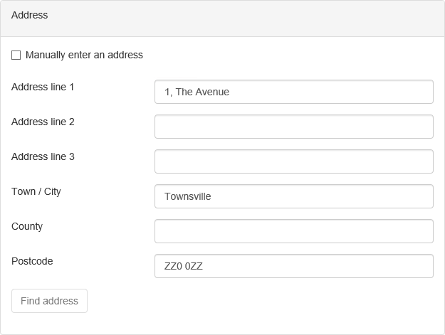
A Find address button, which contacts getaddress.io and retrieves a list of possible addresses within the postcode specified in the postcode field above. The possible addresses are displayed in a drop-down list from which the user can select the relevant address. When the user selects an address, the displayed fields change to the full series of address fields, Town/City, County, Postcode etc. and displays the chosen address. Any lowercase letters in the postcode will be converted to uppercase.
The button's label changes to Change address and clicking the button will clear the postcode and address fields, allowing the user to start again.
Users can type into, and subsequently edit, any of the text boxes in this Element as usual. When a text box has content, an 'x' will be displayed at the right-hand end which can be clicked or tapped to clear the contents.
If an Address Finder Element has an output mapping (see properties below), the address selected or manually entered will be updated in the mapped fields when the form is submitted by the user.
Once you have placed an Address Finder Element on a page, you can edit the Element's properties to configure the Element for your requirements. Select the Element on the page to display its properties in the Properties Pane.
The following properties are available:
Label
Allows you to specify the text that appears in the Element's heading. You can change the default label to provide more meaningful text for your users. The label is used for the heading in both manual and postcode lookup modes.
Address Line 1, Address Line 2, Address Line 3, Town / City, County and Postcode
These properties allow you to change the labels assigned to the fields within the Element to indicate the information required in each field. You can use these properties to provide more meaningful text for your users, if the default values are not suitable.

Visible and Disabled Properties
Checkbox Label
Allows you to specify the text to be displayed beside the check box used to toggle between postcode lookup and manual address entry.

The properties in this section allow you to specify validation criteria for the Element. Validations supported are Required and Max Length but validation error messages are built-in to the Element and any Failure error messages specified within the Rules will be ignored.
You can specify different validation criteria for each line within the Element. Note that the Postcode field has postcode validation built-in and doesn't need to have it set explicitly, but isn't set as Required automatically.
If you have upgraded a project created using a version of Digitise Forms earlier than Digitise Forms - 2021 Spring Update and you have upgraded the Elements on the form to the latest versions, the Rules settings for the Address Finder Element will be slightly different to those available in the earlier version of the Element. From Digitise Forms - 2021 Spring Update onwards, you can specify a Rule for each item in the Element, whereas previously the validation rules were set for the whole Element. When you upgrade to the latest version of the Address Finder Element, the new validation properties will be set to best match the behaviour of the original Element. We suggest you check the validation Rules after upgrading the Element and adjust them if required.

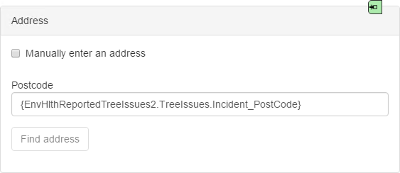
If you specify an input mapping for any fields within the Element, the appropriate mapping will be displayed in each field within the Form Design workspace, in the format {<datasource>.<dataset>.<dataitem>}. For example, the following Address Finder has an input mapping for the postcode field:

You may need to reload the form to display the input mapping. The mapping is only shown in Form Studio and isn't displayed on the published form.
Note that if you have entered an API Key to use the address finder version of this Element and you specify input mappings for any address lines other than the postcode, all address lines will be displayed on the published form not just the postcode field:

 Advanced Tab
Behaviour Category
Allow Lookups
This property is only relevant if you have entered an API Key in the API Key property (see below). If Allow Lookups is selected, the Address Finder will work in postcode lookup mode, if not selected the Element will change to manual address entry mode and postcode lookup will be disabled.
Configuration Category
API Key (Required)
Enter your getaddress.io API Key here.
If you want to use the postcode lookup feature, you must enter a valid getaddress.io account API Key here. If you don't enter a Key here, the setting of the Allow Lookups property above is ignored.
Styles Category
Label, Body and Error Message
These properties allow you to assign a style to the label, body and invalid data error message text, respectively, e.g. to set the font type, size and colour.
Button Label Style
Allows you to assign a style to the Find address/Change address Button's Label, e.g. to set the font type, size and colour.
Button Style
Allows you to assign a style to the body of the Find address/Change address Button, e.g. to set the background colour.
If you have upgraded a project created using a version of Digitise Forms earlier than Digitise Forms - 2021 Spring Update, this property will only appear if you have also upgraded the Elements within the project, in which case this property will automatically be set to the same value as the Button Label Style property above.