Progress Bar Element

The Progress Bar Element allows you to display a visual indication of progress through an action or process. You can control the progress of the bar along the Element as the action or process proceeds so that at any one time the bar indicates how far through the action or process you are and how much is still to go.
You could use a Progress Bar in the page Header section to indicate how far through your form the user is. Alternatively, you can show progress through your form using one of the Navigation Bar Elements.
You control the filling of the Progress Bar using its Value and Secondary Value properties, which can be updated using a data input mapping or within custom JavaScript.
Once you have placed a Progress Bar on a page, you can edit the Element's properties to configure it for your requirements. Select the Element on the page to display its properties in the Properties Pane.
The following properties are available:

Visible and Disabled Properties
Height
Allows the height (in pixels) of the Progress Bar to be set.
Width
Allows the width (in pixels) of the Progress Bar to be set.
Type
Allows the Progress Bar to be configured as a Linear or Circular Element.
Right to left
If selected, this option sets the Progress Bar to run from right to left. If Circular has been chosen for the Progress Bar Type, selecting Right to left will make the Progress bar run anti-clockwise. By default, the Progress Bar runs from left to right (or clockwise, in the case of a Circular Progress Bar).
Segments
Allows the number of segments that the Progress Bar will contain to be set. You may wish to split the Progress Bar into segments to show how much of the action or process has been completed. For example, if you'd like the Progress Bar to be split into 50% blocks, then the number of segments should be set to 2. If you wanted to see 25% blocks, then you would choose 4 segments, and so on.
In the below image, the Progress Bar has been split into 20% blocks, so the number of segments has been set to 5.

Gap Width
Allows the distance (in pixels) between separate segments to be set.
Corners
Allows the corners of the Progress Bar to be set to Square or Round.
Track Thickness
Allows the thickness (in pixels) of the Progress Bar track to be set.
Progress Thickness
Allows the thickness (in pixels) of the Progress Bar progress indicator to be set.
In the below image, the Track Thickness (shown in grey) has been set to 30 pixels and the Progress Thickness (shown in brown) has been set to 10 pixels.

Role
Allows a pre-set colour to be applied to the Progress Bar to reflect the underlying action or process which the Progress Bar is linked to.
For Normal, the Progress Bar will be coloured Pale Blue.
For Success, the Progress Bar will be coloured Green.
For Info, the Progress Bar will be coloured Mid Blue.
For Warning, the Progress Bar will be coloured Brown.
For Danger, the Progress Bar will be coloured Red.
Note that where a Secondary Value is used (see Data Tab, below), the colour for the Secondary Value will be a paler version of the colour used for the Value. The Value will show the colour for whichever Role has been selected.
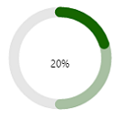
In the below image, the Role has been set to Success (green), and the Value has a percentage of 20%. The Secondary Value has been set to 50%, as indicated by the paler shade of green.


Value
Contains the current Value of the bar. If you enter a value here in Form Studio, this will set the start value for the progress bar. The Value can be any number between 0 (bar empty) and 100 (bar full). Alternatively, you can specify an input mapping which can supply the start and, if required, subsequent values to move the bar along at runtime. For more information see: Data Tab Properties.
Secondary Value
Contains a Secondary Value for the bar. If you enter a value here in Form Studio, this will set the start value for the secondary portion of the progress bar. The Secondary Value can be any number between 0 (bar empty) and 100 (bar full). Alternatively, you can specify an input mapping which can supply the start and, if required, subsequent values to move the bar along at runtime. For more information see: Data Tab Properties.
The Secondary Value can be used to help visualise a dependency between two separate actions or processes. When the first action or process completes as indicated by the Value, the progress of the second action or process can be monitored using the Secondary Value.

Animation Category
Animation
Allows the type of animation which will be used for the Progress Bar to be set. The available options are: None, Normal, Striped, Active and Indeterminate.
Duration
Allows the duration (in milliseconds) of the animation to be set.
Delay
Allows the delay (in milliseconds) for the animation to be set.
Circular Styles Category
When Type is set to Circular on the Appearance tab, the following settings will apply.
Pie
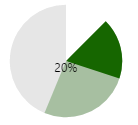
This option allows the Progress Bar to be rendered as a Pie Chart. The white circle which usually appears in the centre of the circular-type Progress Bar will be removed when this option is selected.
Start Angle
Allows the degrees angle at which the Progress Bar will start to be set. In the following image, the Pie option has been selected and the Start Angle has been set to 45 degrees.

End Angle
Allows a degrees angle to be set in order for the Progress Bar to be rendered as a whole- or part-circle. If, for example, 360 degrees is entered, the Progress Bar will display as a whole circle. If 270 degrees is entered, the Progress Bar will display as a three-quarter circle. For 180 degrees, the Progress Bar will display as a semi-circle, and so on.
Inner Radius
Allows the radius (in pixels) of the section that runs from the centre of the circle to the outside edge of the Progress Bar to be set, up to a maximum of 200 pixels.
Outer Radius
Allows the radius (in pixels) of the portion of the Progress Bar that runs from the centre of the circle to the outer, grey edge to be set, up to a maximum of 200 pixels.
Radius
Allows the overall radius of the Progress Bar to be set, up to a maximum of 200 pixels.
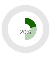
To illustrate the differences between the radius measurements, in the below image, the Pie option has been de-selected so that the white circle in the centre of the Progress Bar is visible. The Inner Radius (the distance from the centre of the white circle to the outside edge of the green bar) has been set to 30 pixels, the Outer Radius (the distance from the centre of the white circle to the outside edge of the white bar which encircles the green bar) has been set to 50 pixels, and the Radius (the distance from the centre of the white circle to the outside edge of the outer, grey circle) has been set to 75 pixels.

When the Inner Radius, Outer Radius and Radius measurements are all the same, no white space will appear to the right of the Progress Bar, and there will be no outer, grey bar. A white circle will appear in the centre of the Element next to the Progress Bar (provided the Pie option has been de-selected). In the below image, the Pie option has been de-selected and the Inner Radius, Outer Radius and Radius options have all been set to 100 pixels.

Label Category
Label
If this option is selected, the wording for the percentage completed (e.g., '25%') will be visible on the Progress Bar in the chosen font size and colour (see below).
Text Alignment
Allows the position of the Label to be set to Near, Center, or Far within the Value percentage block (see Value description under Data Tab, above).
For Near, the Label will sit towards the left-hand side of the Value percentage block:

For Center, the Label will sit in the centre of the Value percentage block:

For Far, the Label will sit towards the right-hand side of the Value percentage block:

Font style
Allows Normal, Italic or Oblique styling to be applied to the Label font.
Font weight
Allows Normal, Bold or Lighter styling to be applied to the Label font.
Font size
Allows the size (in pixels) of the Label font to be set.
Font colour
Allows the colour of the Label font to be set. Using the colour palette available via the drop-down, a standard colour can be selected. You can, if you wish, configure a non-standard colour for the bars using Red, Green, Blue & Alpha or hexadecimal values. Click the Advanced button at the bottom of the colour palette to access the advanced colour settings.
To use the advanced colour settings, move the individual sliders to the desired values for each of the RGBA components, or enter a hexadecimal value - including the hash (#) - in the box above the RGBA sliders. Alternatively, use the double-arrow slider to the right of the RGBA options to pick a colour from the block of colours displayed. The chosen colour will be displayed in the box next to the hexadecimal value. If you use the double-arrow slider, the RGB and hexadecimal values will change automatically as you move the slider up and down. The Alpha value won't change, however, and you will need to set this manually.
For RGBA, the Alpha value is the level of opacity that will be applied to the base RGB colour within the range 0-255, with 0 being the most transparent, and 255 being the most opaque. The default of 255 will be applied automatically to any colour values selected, so this will need adjusting if you wish the colour to be less opaque. To revert to standard colours, click the Standard button beneath the RGBA settings.
Styles Category
Allows you to assign a style to the Progress Bar and Progress Bar Label, e.g. to set the font type, size and colour.
Note that any styling applied using the settings described above (e.g., Label Font Style and Weight etc.) will overwrite any styling contained within the named styles for the Progress Bar and Progress Bar Label.